Case Studies
Xavier Portela - The Importance of Color Space | EIZO
Xavier Portela is a Belgo-Portuguese photographer. He is known for his visual onslaught of signs and neon lights series. In his personal review Xavier Portela gives an insight why he chose an EIZO monitor and how his works benefits from CG279X.
Why I Chose EIZO
I’m a Belgo-Portuguese self-taught photographer and creative director currently based in Brussels. Although I didn't start my career as a photographer, I did always work with computers, and spent countless hours in front of monitors, from the old 14-inch CRT to the recent 27-inch IPS. I was a web developer for almost 7 years but it’s only when I started learning photography that I considered spending more money on good monitors. I was always frustrated to see my photographs on another screen because most of the time they didn’t match the way I processed them. The issue was I didn’t know if the problem was coming from the other person's monitor or mine. At the time, I bought a calibration device to control the color accuracy of my screen but I was still frustrated to see deviations from monitor to monitor.
After a while, I just stopped calibrating my monitor and quickly decided to take another approach around my problem. I bought an Apple iMac 27 because many people were using Apple hardware and Apple screens, so it made sense to me that if I worked on the most common system, people will see what I see. It did work for a while when my photographs were only shared online. I didn't have any print photography because it was just a hobby, a passion that I was doing on the side, meaning also that I couldn't really afford to spend more money on it. I knew EIZO by name, I knew their reputation, but it was too early in my career to invest in such a high-fidelity monitor.
In 2012, I left my daily job as a developer to devote all my time to photography and filmmaking. At that moment I invested mainly in cameras and lenses, not in my workstation. I still had the same approach: “If you use what most people use, there is a good chance they will see what you see”. I even ended up buying the Apple Cinema Display. It was a mistake; I was furious because I couldn't get the exact same color on my laptop and my external screen.
At the end of 2016, I gained visibility after publishing “Glow”, a series of photographs featuring Tokyo and Hong Kong at night. This series has reached more than 30 countries and has been published in various photography, design, and architecture magazines. It was time to do my first solo exhibition and I was back to the main issue with my workflow: having color accuracy from the screen to the print. Luckily for me, the lab prepared my files and it went smoothly.
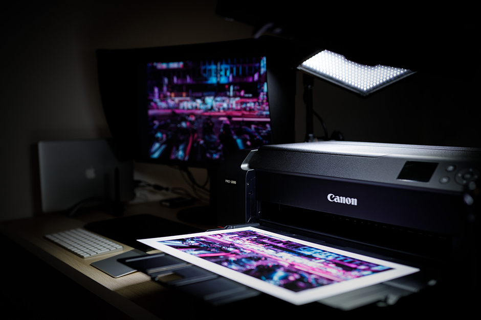
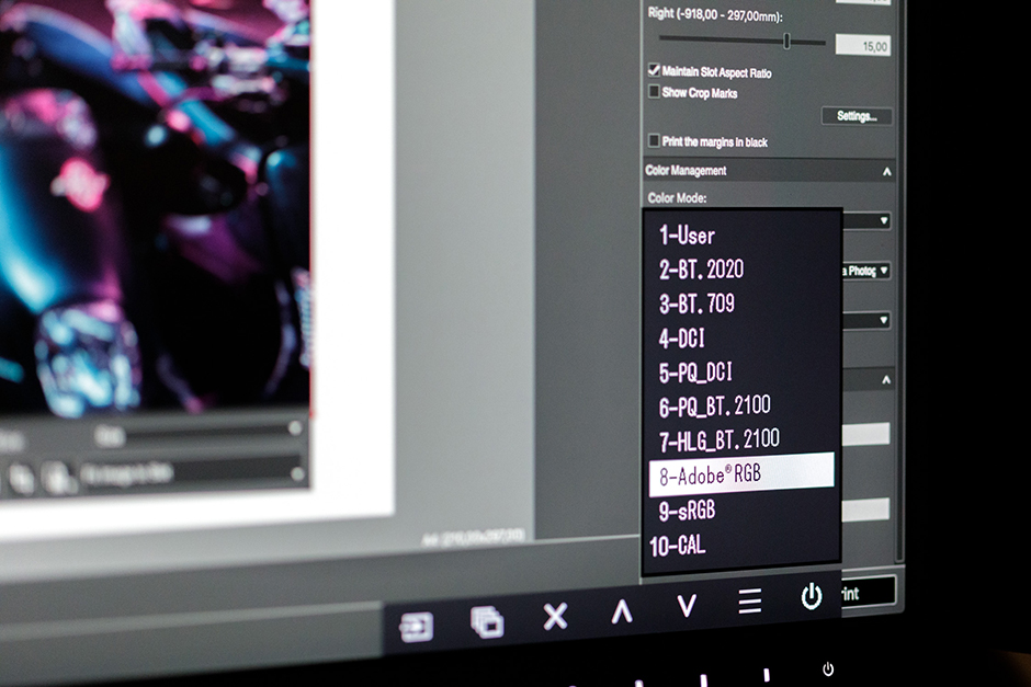
The Importance of Color SpaceThat first experience triggered the desire to print more, to be able to see my work on paper. More importantly, I wanted to be able to do it myself. I reached out to Canon Belgium for advises on which fine art printer could match my needs and expectations in terms of quality and still be easy to use for a novice. I finally got a Canon ImagePROGRAF Pro-1000. It is perfect, it’s the first printer that allow me to really enjoy the print production and see my work on paper. A couple of months after playing with the printer, I decided to sell my prints online. It was a project I had in mind for a while. I couldn't afford to waste money on fine art paper and archival ink because of bad color management. It was time to get a monitor that would show my prints as they will be on paper, allowing me to use Adobe RGB and soft proofing with paper specific ICC profile. |
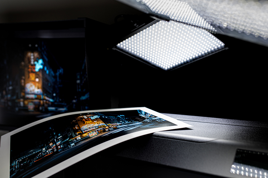
Exact Colors and Effortless CalibrationAn important thing is that such a monitor really gives another dimension to your raw files. In my case I discover the raw files from my Canon EOS 5D Mark IV contain way more information in the lowlights and highlights that I could see before. When I prepare my photographs for print on my EIZO monitor I see details I couldn't see on a sRGB screen. I like the fact that the complete color management is handled by the monitor, my intervention is purely artistic, adjusting the image to my taste and then print it, it’s completely transparent to me. |
|
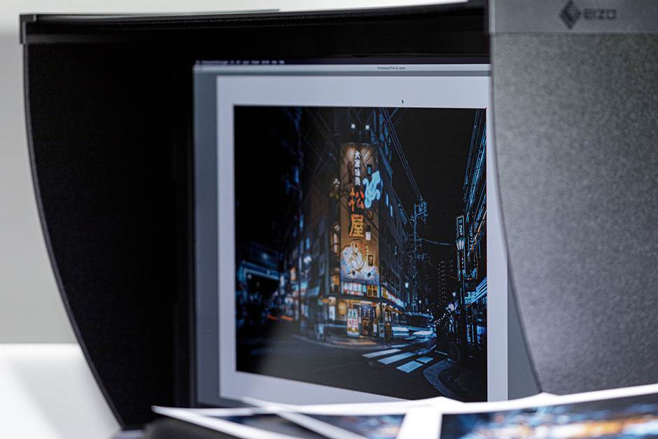
The EIZO CG279X is modest in its appearance, classy, black, timeless elegance, but it’s when you face it every day that you understand why EIZO enjoys such a professional reputation among photographers. It’s how they manage, to subtly, make every little detail above expectations, that make this monitor an amazing piece of technology. At the end of the day, my journey through photography is also a constant search for the best quality at every level, from camera to printer and monitor.
I went straight for EIZO, I knew them already for years, their reputation is the best in the industry. I setup my print studio with the EIZO CG279X and I couldn’t be more satisfied with it. One of the main reasons I was convinced by that model aside from his consistent color accuracy was the self-calibration system. This is pure science fiction to me; the monitor is scheduled to self-calibrate before I get to the studio. I do nothing, it’s completely hassle-free. When I arrive at the studio, I can focus on preparing my files and print them. That’s it.
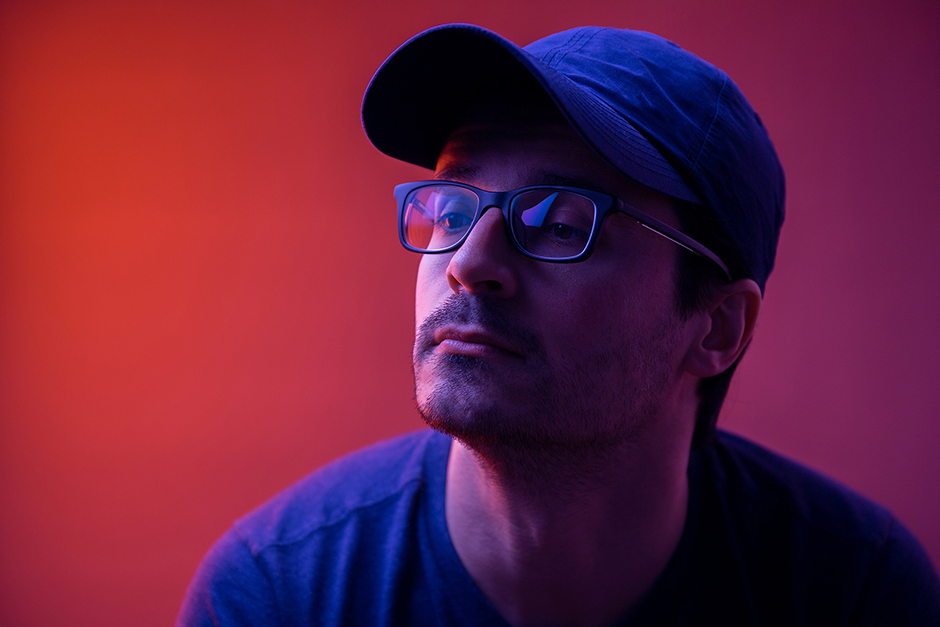
About Xavier PortelaXavier Portela is a self-taught photographer and filmmaker based in Brussels. Xavier Portela started his career as a web developer after studying multimedia in Belgium. In 2012, he decided to drop his career as developer and his comfortable position for Bose Europe to work on his own, in order to follow his passion for images and become a photographer. Since then he is known for his visual onslaught of signs and neon lights series.Xavier Portela’s website |
Deployed Product

